Hue Are You
Hue Are You is a woman of colour owned small business, offering a personal colour analysis service to clients in the Calgary and surrounding area. It was created on the foundation of being confident in your own skin and reducing impulse purchases, and the first to specialize in the Korean Colour Analysis System.
Problem
Hue Are You was tight on time to dedicate to the website, which meant the website they roughly designed was not user friendly. Despite being made on Framer and the utilization of micro-interactions, the website was one long page with anchorlinks, and large chunks of copy. Considering the website's primary user's would access the site through a mobile device, the copy and anchorlinks make for a disjointed journey and poor user experience.
Solution
I re-designed the website by adding more pages to allow for a break amongst all the copy, while upholding the luxury service brand identity. This allowed for easier navigation and an intentional user journey based on the user's needs when visiting the site. Visiting via their mobile device means not being overwhelmed by the copy, while also being educated of the services provided.

Impact
A 53.6% bounce rate for a two week old business falls within the average range. Given this is a new business and new website, it presents the opportunity to improve the SEO.
Over 80% of users are mobile users, which is accurate based on what we discussed when creating our personas and the user journey.
We initially created a path that users would first explore what the business is on the About page, go to the Services, and the hit Book. But based on the bounce rate, we assume that users are hitting Book directly when on the home page. This led to the conclusion that users are getting the information they need from the homepage.

Time
2 months
Tools
Figma, Framer
Team
UX Designer, Client
Role
UX Designer
Discover
Goals
Convert website visits into bookings.
Seamless responsiveness.
Transparency in services and science, including colour curator's credentials.
Strengthen brand identity (warm, elegant, clean, playful).
Scalable for future business growth and needs.
Research Takeaways + SWOT
Clients want a breakdown of what the service will include - an element other colour analysis studio’s include to make bookings efficient.
Little to no local competition, Hue Are You is the first of it’s kind in Calgary.
Booking Policies should be clear and concise.
CTA leading to bookings should be easily and readily accessible, inviting the user to end there journey with a booking.
Due to Hue Are You being the first of it's kind in Calgary, and offering a personal colour analysis using a system (Korean Colour Analysis System) that is seeing lots of traction through social media, it has the opportunity to set the bar.
Experience
Target Audience & User Journeys


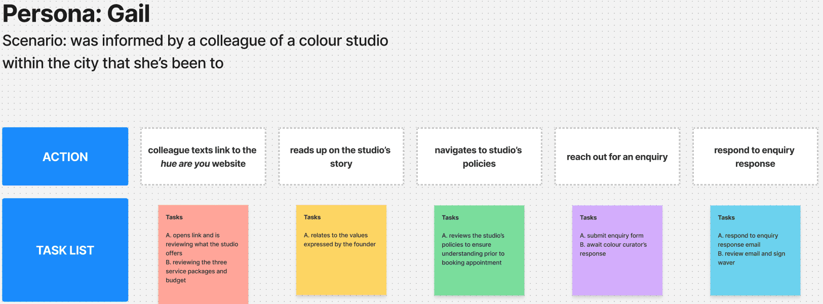
How might we create an elegant website that reinforces Hue Are You’s brand, and makes clients feel confident with the quality of the service to book a session?
Develop
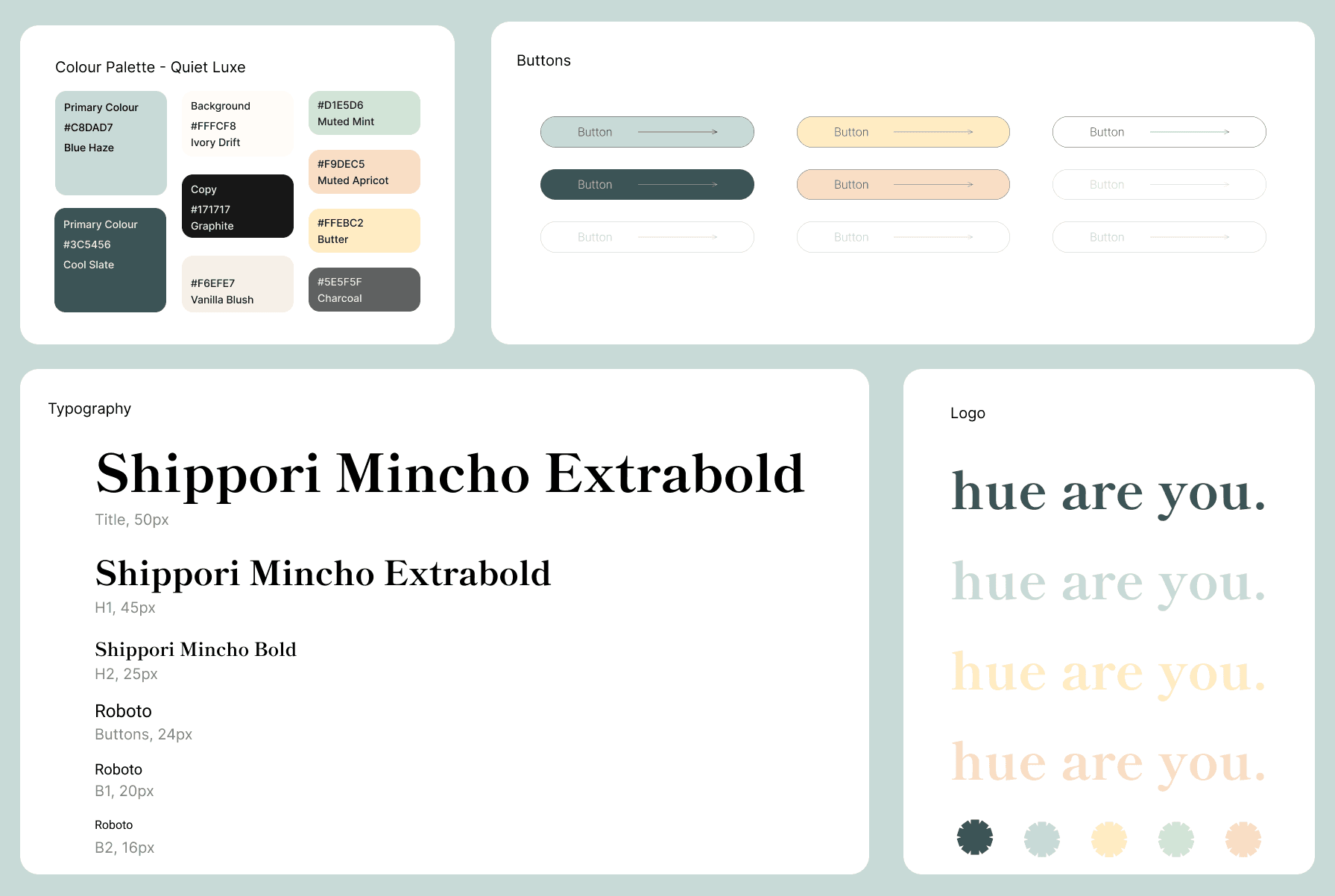
Style Guide
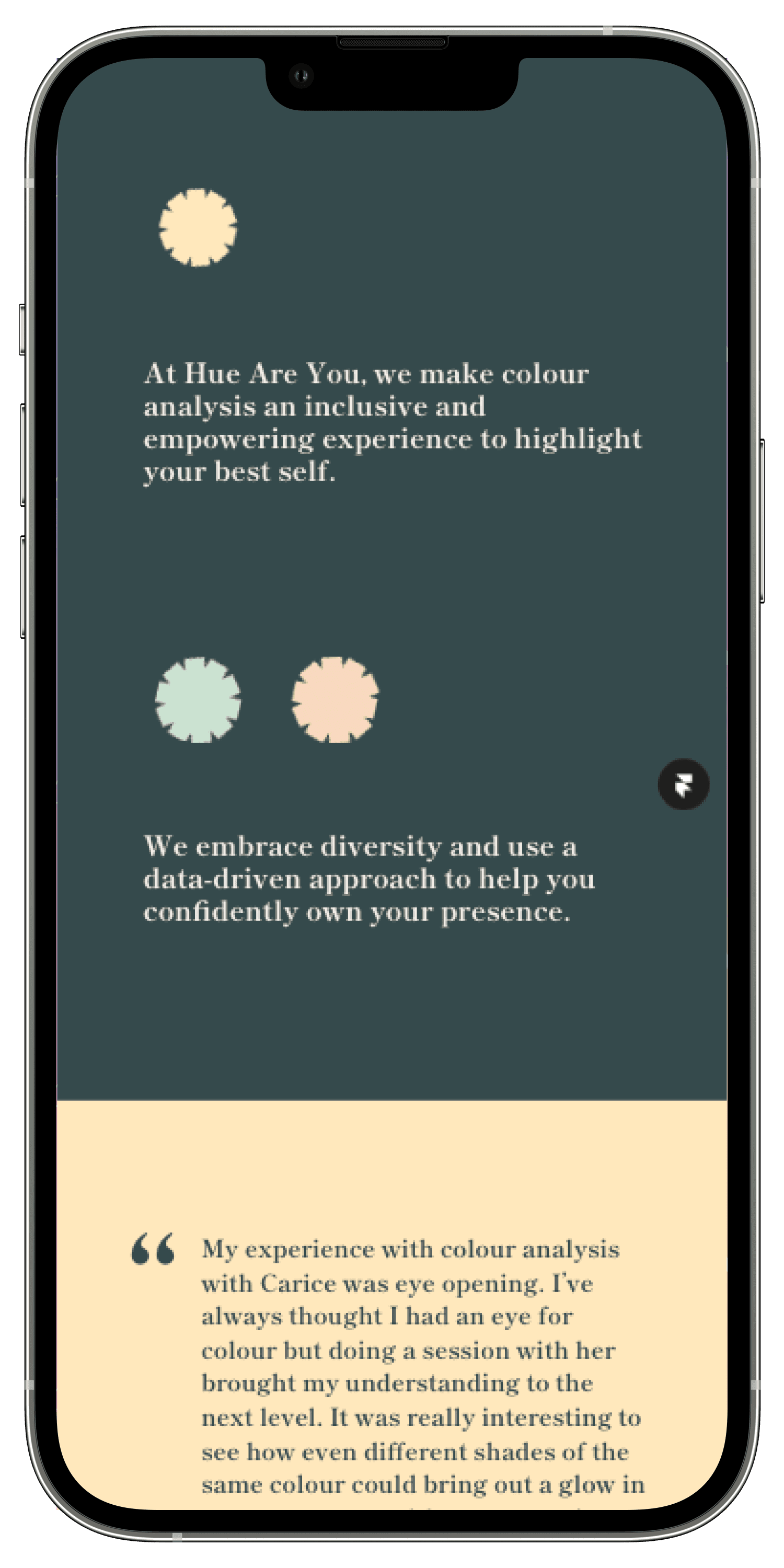
Hue Are You already had the brand identity finalized, with a focus on elegance, luxurious, clean, and service focused.
Blue Haze - primary CTA
Cool Slate - logo, headings
Charcoal - subheadings
Muted Apricot - secondary CTA
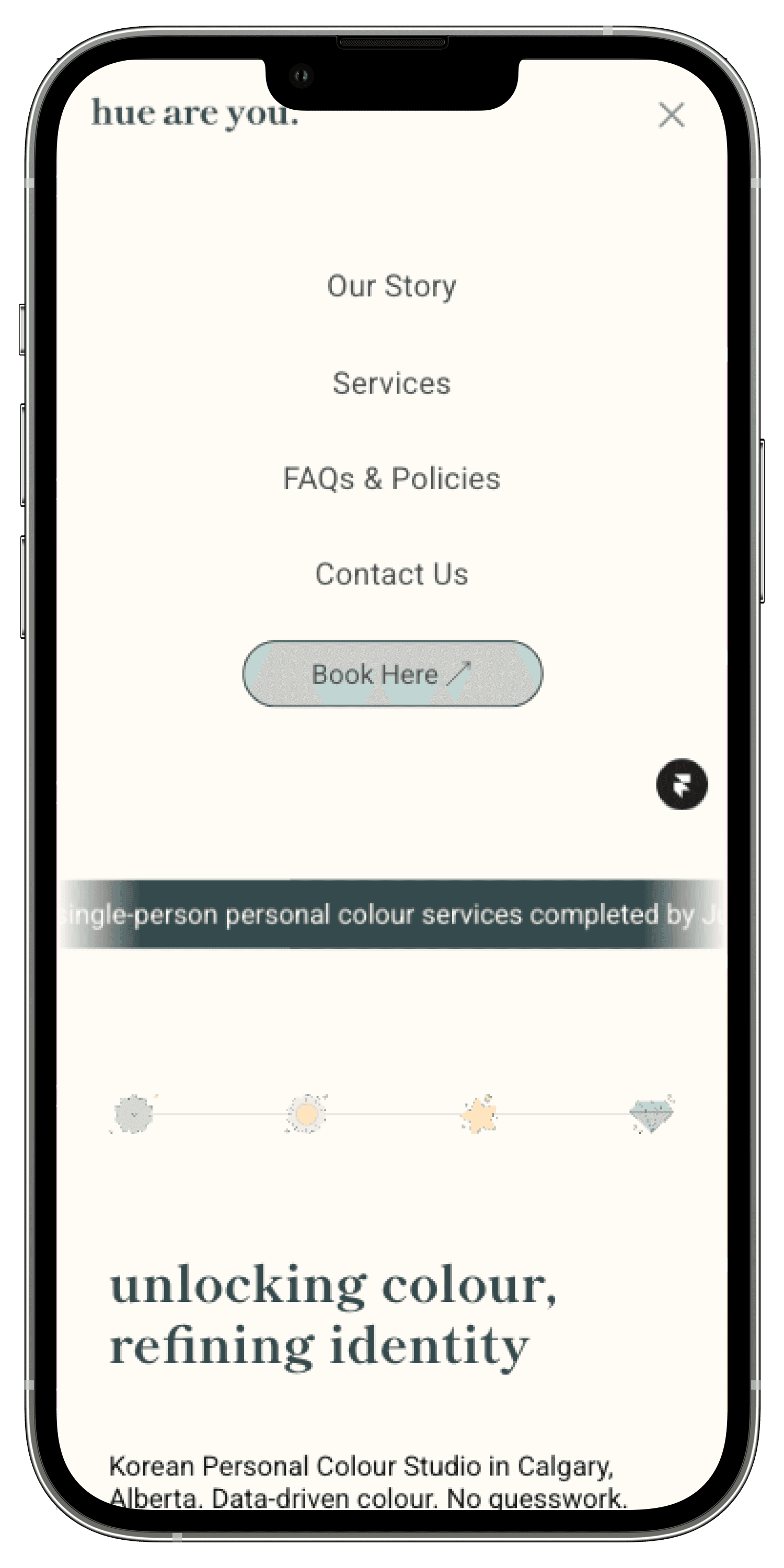
Site Map
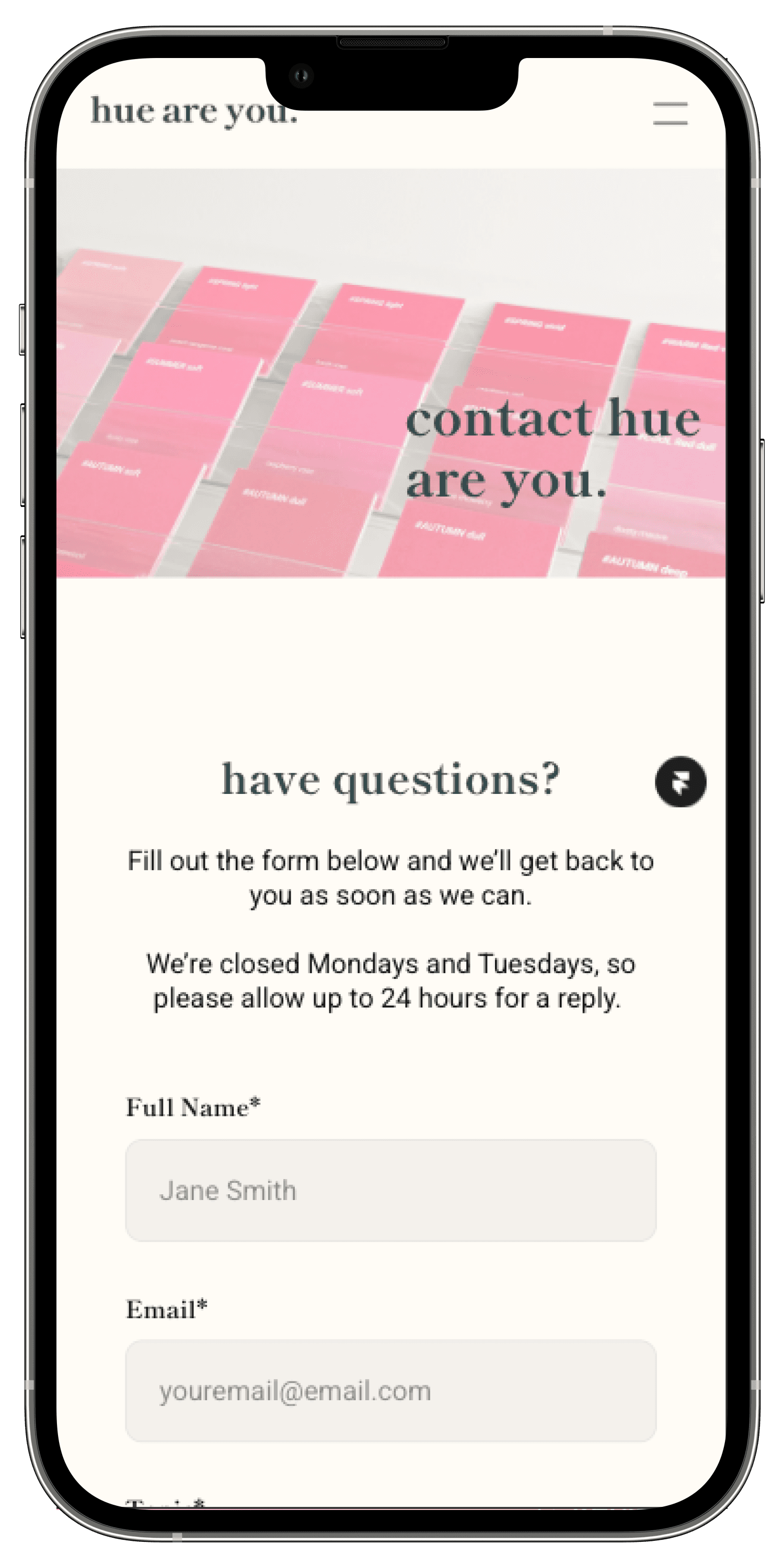
With one of the primary goals being visit to booking conversion, it was essential every page contained a Book Now cta.

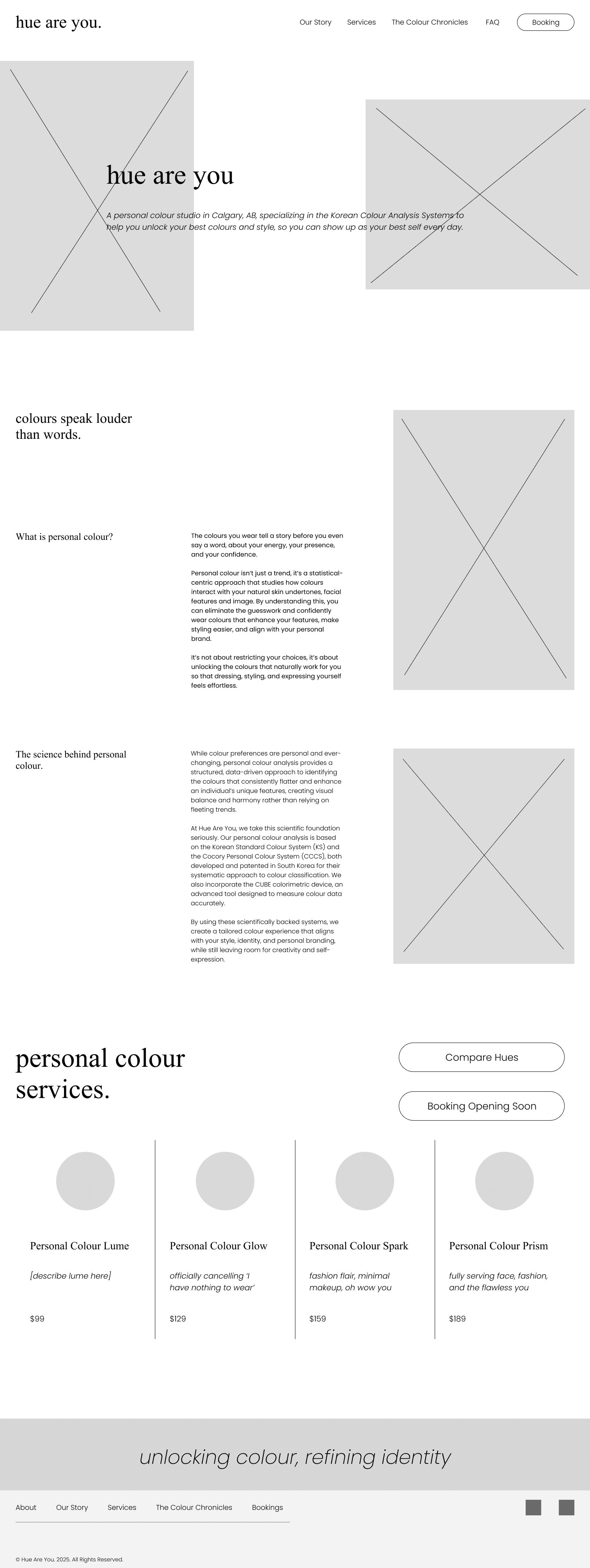
Mid-Fi Wireframes
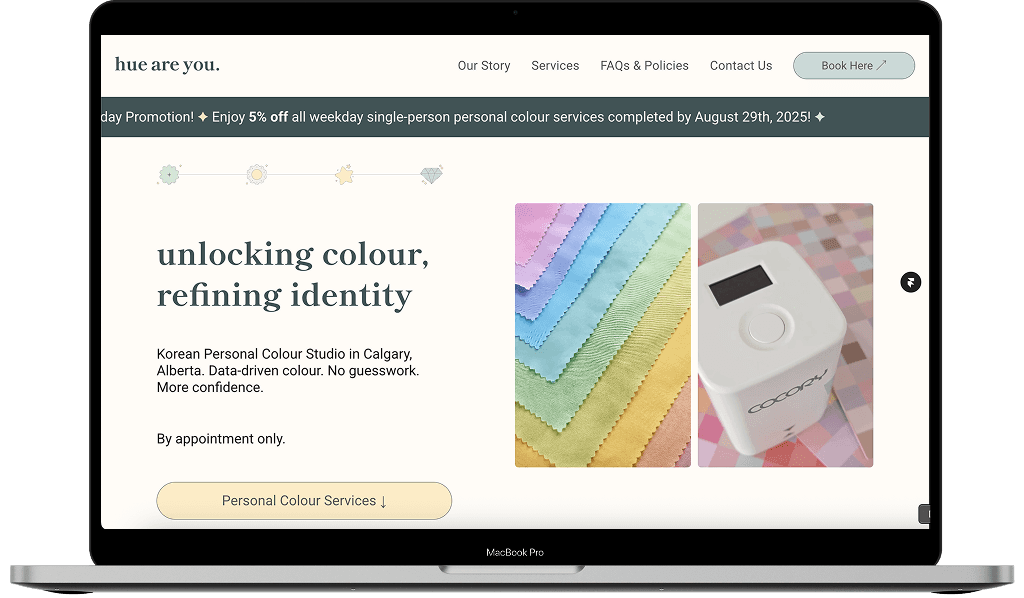
Homepage
Option 1: educating user about the benefits of personal colour analysis
Option 2: have an icon correlate to each copy, allowing for easy breaks
Option 3: hero layout options - classy or playful
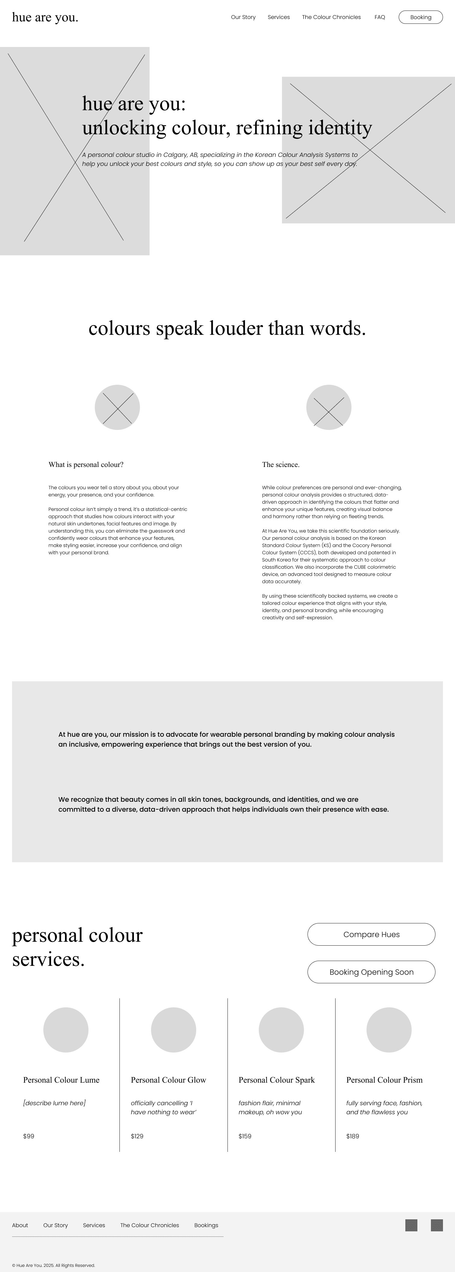
After breaking down pain points, we went with the second version to allow for easy picture-copy correlation and to remove the sense of the user being overwhelmed. With the use of white space, the content is easier for the user to digest while focusing on the Why and What.
Delivery
Key Screen Iterations
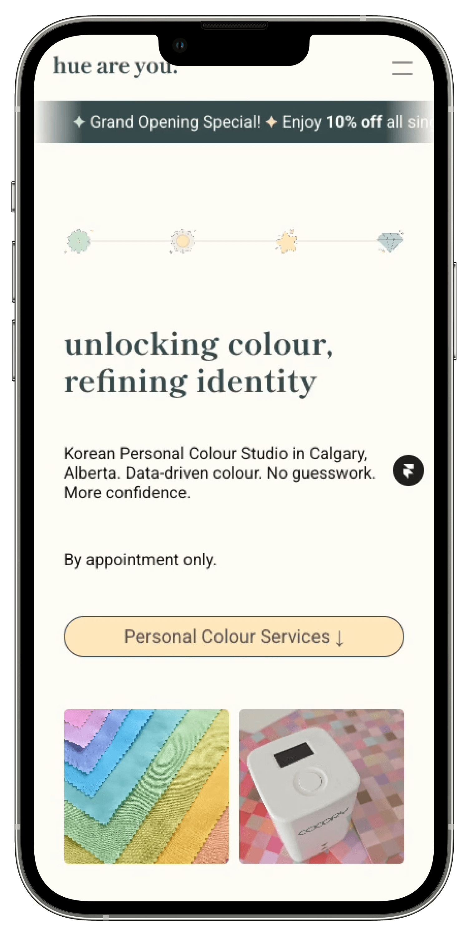
The Homepage went through the most iterations.
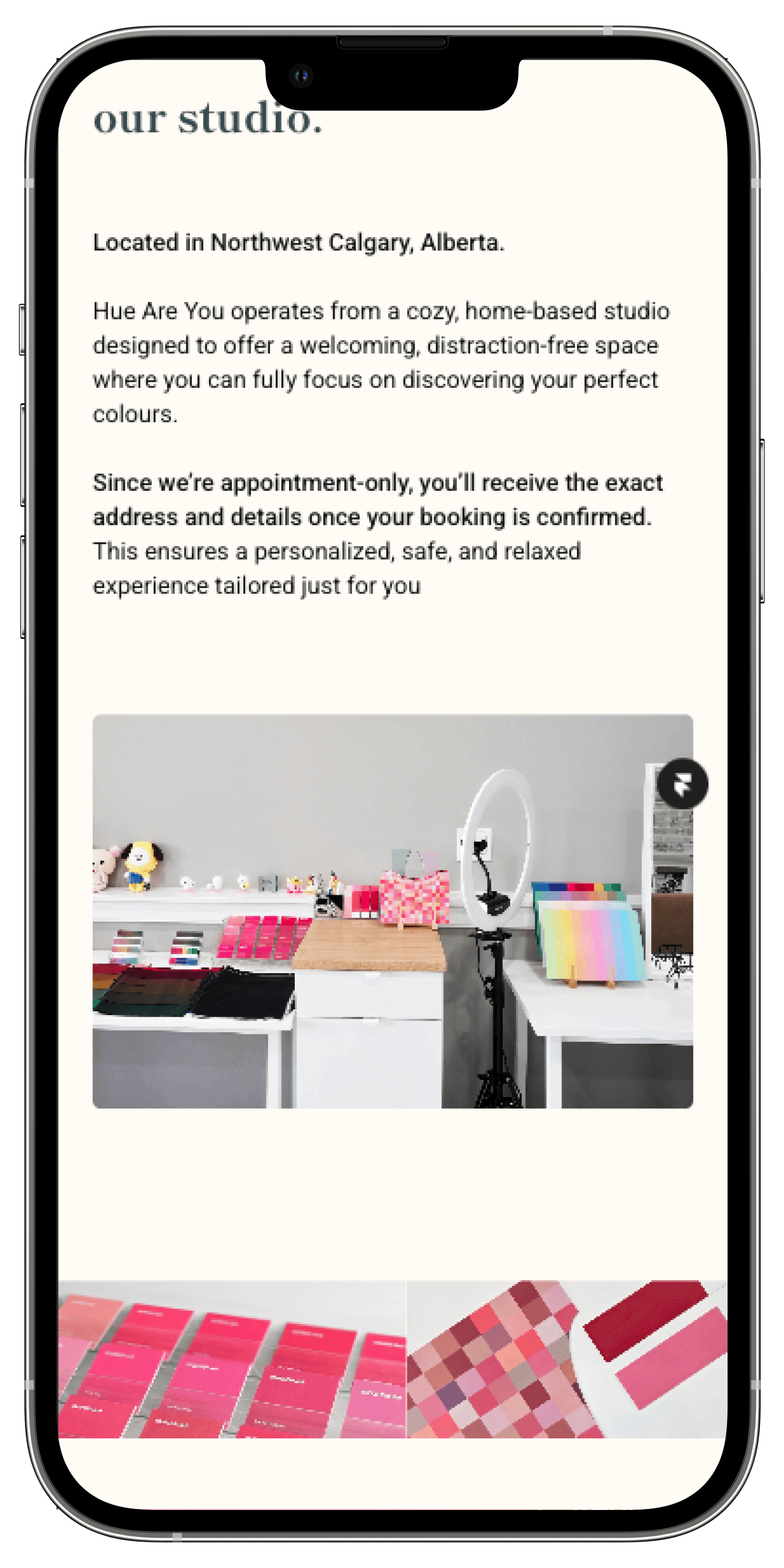
The integration of cards was used to help segregate the large amounts of copy, and group certain topics/services together.
The homepage’s hero was having issues with accessibility, and the message of what Hue Are You is was getting lost. We decided to simplify it, and incorporate the service package’s icons to tie it back to the services offered. Other aspects of accessibility include white space and no text over images.

After a lot of back and forth, we decided to remove the chart and utilize the cards to provide the user with a brief explanation on what each service is. Each service package has it’s own icon which is included in the Personal Colour Process, indicating what package the service is included.
Final Product


What's Next?
With the site and Hue Are You’s services now live, we’ve scheduled an audit in one months time to review visit’s and successfully convert into bookings and improve SEO conversion. We also plan to refine the happy path that we planned with the path the user created when utilizing the site.
Testimonial
Balpreet did an incredible job bringing Hue Are You to life online. She took the time to deeply understand our needs, not just visually, but as a business. She translated that into a website that feels aligned, intentional, and easy to navigate for our audience.
Balpreet thoughtfully designed every section with our clients in mind, making it simple for them to understand our services, our mission, and how to take the next step. It’s rare to find someone who combines creative vision with strategic clarity so seamlessly!
Cannot recommend her enough!
Carice Chan, Founder & Colour Curator

Reflection
I enjoyed working with Hue Are You, and being part of their launch. From making sure that the website was functioning between completion and launch, to ensuring any and all small tweaks were made.
However, this project also taught me client management firsthand, and the benefits of having a contract. It not only sets the expectations the client has of me, but the expectations I have of the client in return. This not only ensured the project was delivered on time, but clear a project that the client and I are both proud of.